The art of colour
The colour of your windows plays an important part in your home’s overall aesthetic – and can often be one of the most enjoyable elements of an improvement project. These days you can choose from a range of modern frames in a variety of colours, from classic white and woodgrain to eye-catching pastels. But how do you decide which one is right for you?
We’ve looked at some of the most popular frame colours and shared a few suggestions on how you can make the most of them. However, before diving straight in with your favourite colour, there are a few things to consider…
What works for you and your home
Start by looking at the style of your property. Is it a Victorian townhouse, a country cottage or a new build? What is it made from? Bear in mind that some colours suit certain buildings more than others, for example, earthy colours look good against red brick while dark tones can be striking on a contemporary home.
How colour makes you feel is another important factor – natural colours can be comforting whereas white and grey are coolly elegant. Think about the impact you want your frames to make. Do you want them to make a statement or do you want them to blend in?
Look on the white side
White frames are classic for a reason. They have been the standard for over a century and remain popular because they suit so many property styles. White creates a fresh look that allows other architectural features to stand out or provides an eye-catching accent colour against a dark background.
The minimalist look of white frames lends itself well to one of the most enduring trends of recent years – Scandinavian style. This light, bright aesthetic manages to be both pared-back and cosy all at once. Tap into this trend by decluttering, maximising your natural light through a muted colour palette or clever placement of mirrors, and using a mix of textures, such as fake fur throws or sheepskin rugs. The Scandinavians are masters at crafting interiors that make you feel good even during a long dark winter. So when the sun is shining, throw your windows open to get the endorphins flowing or curl up on the sofa with a hot chocolate and a woollen blanket when it’s dark and rainy.
White frames also let you experiment with bolder colours elsewhere. Try a ‘one colour contrast’ where you coordinate a single accent colour against a white background. The beauty of white means you could choose your favourite colour and go to town with the likes of cushions, bedding, curtains, artwork… You name it.
When it comes to the frames themselves, there’s more out there than just standard white uPVC. The Residence Collection offer a subtle white timber effect frame called ‘Grained White’, which recreates the chalky look of white painted timber. Whereas crisp, white aluminium frames by SAS Aluminium look great on contemporary homes.
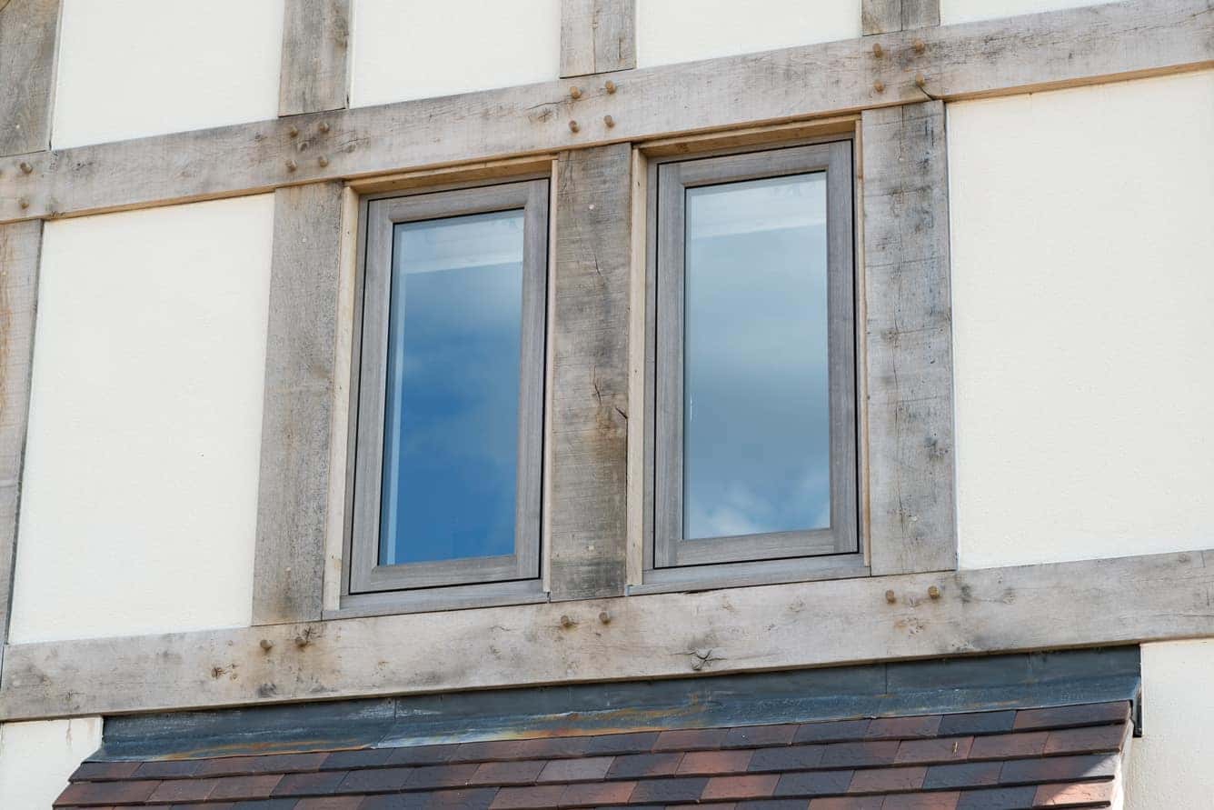
Right: An authentic timber finish – The Residence Collection R9 flush window in Grained White
Knock on wood
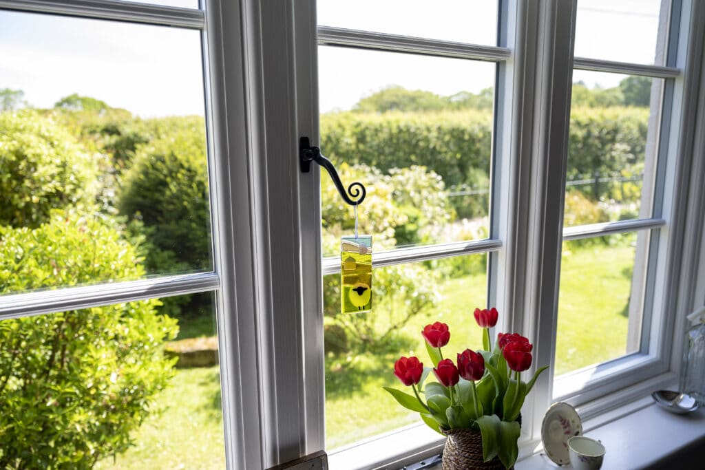
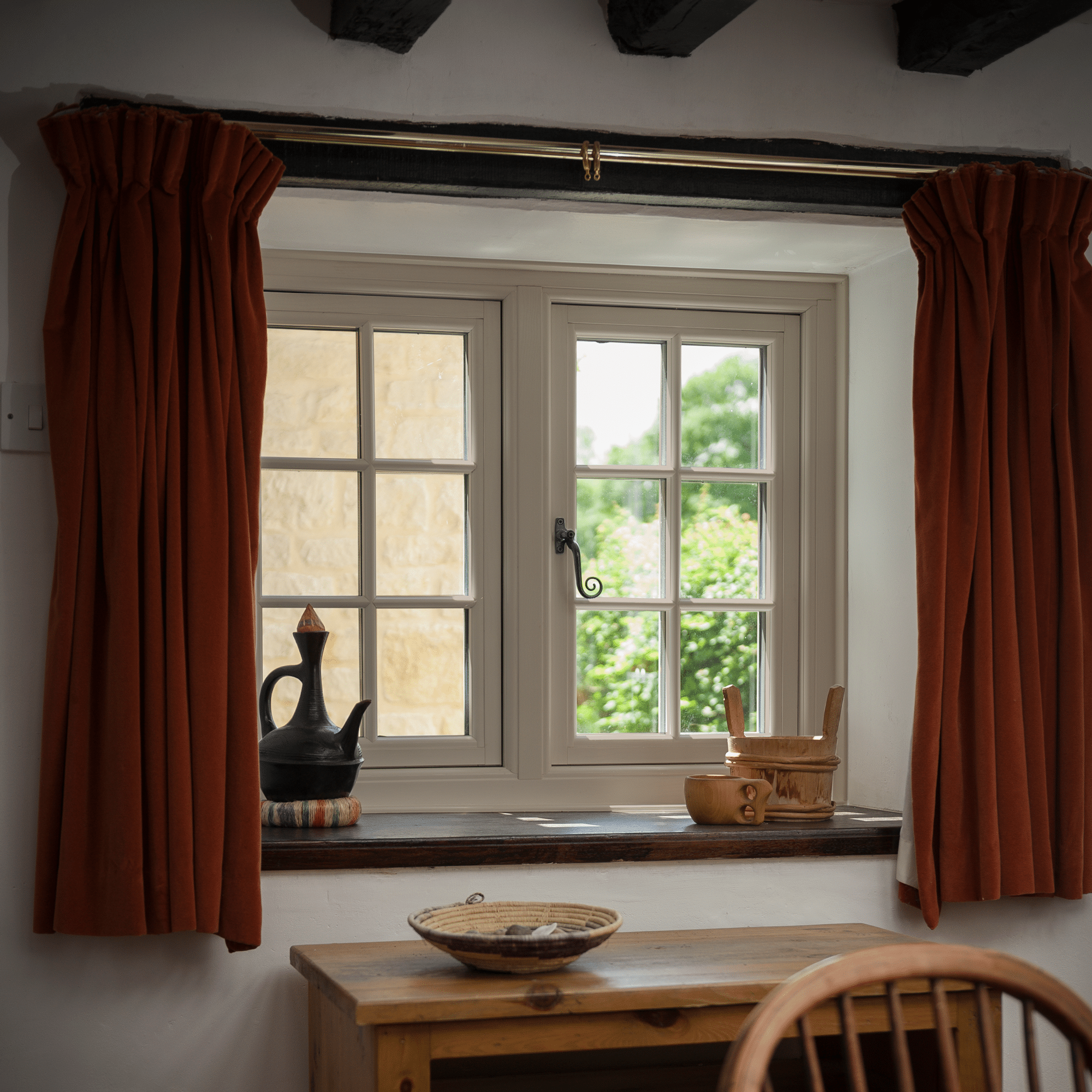
If you love the traditional look and feel of timber but want the ease and convenience of uPVC, you’re in luck. Timber effect uPVC frames look like the real thing and come in a range of rich, earthy finishes like oak, rosewood and mahogany. The Residence Collection also provide lighter hues, such as Silvered Oak or Pepper Oak, which have more of a coastal feel.
Woodgrain is a great option for heritage properties or if you’re looking to recreate the on-trend ‘cottagecore’ style. Natural wood tones are associated with warmth and comfort, so woodgrain frames can make your home feel like a relaxing refuge away from the stresses of the outside world. Cottagecore is all about embracing this cosy feeling.
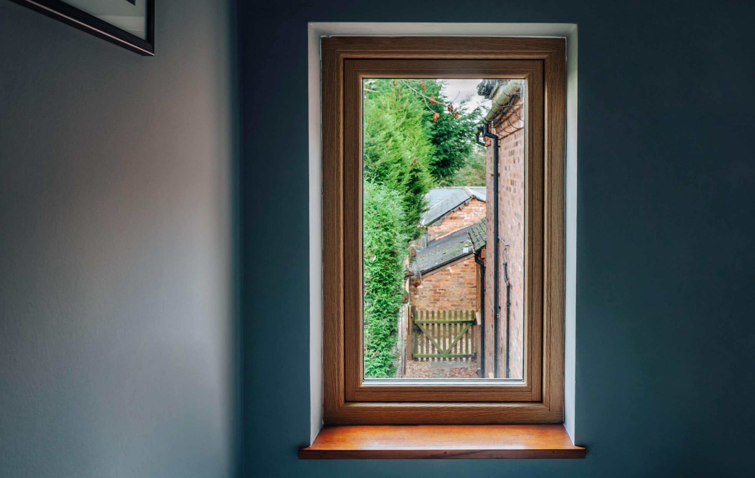
Right: The Residence Collection’s English Oak finish adds warmth to cool interiors
Coordinate your frames with gingham or flower prints. Go hunting for antiques – the ‘cluttered’ aesthetic of cottagecore means you can fill up your home with as many knick-knacks as you like. Keep the natural theme going with retro kitchen utensils or accessories made from organic materials. Imagine a freshly baked Victoria sponge on an antique cake stand or tea from a china tea set in front of the fire. Cottagecore gives you the perfect excuse to treat yourself. And as it actively encourages clutter, it’s the perfect backdrop for busy family life.
Pretty pastels
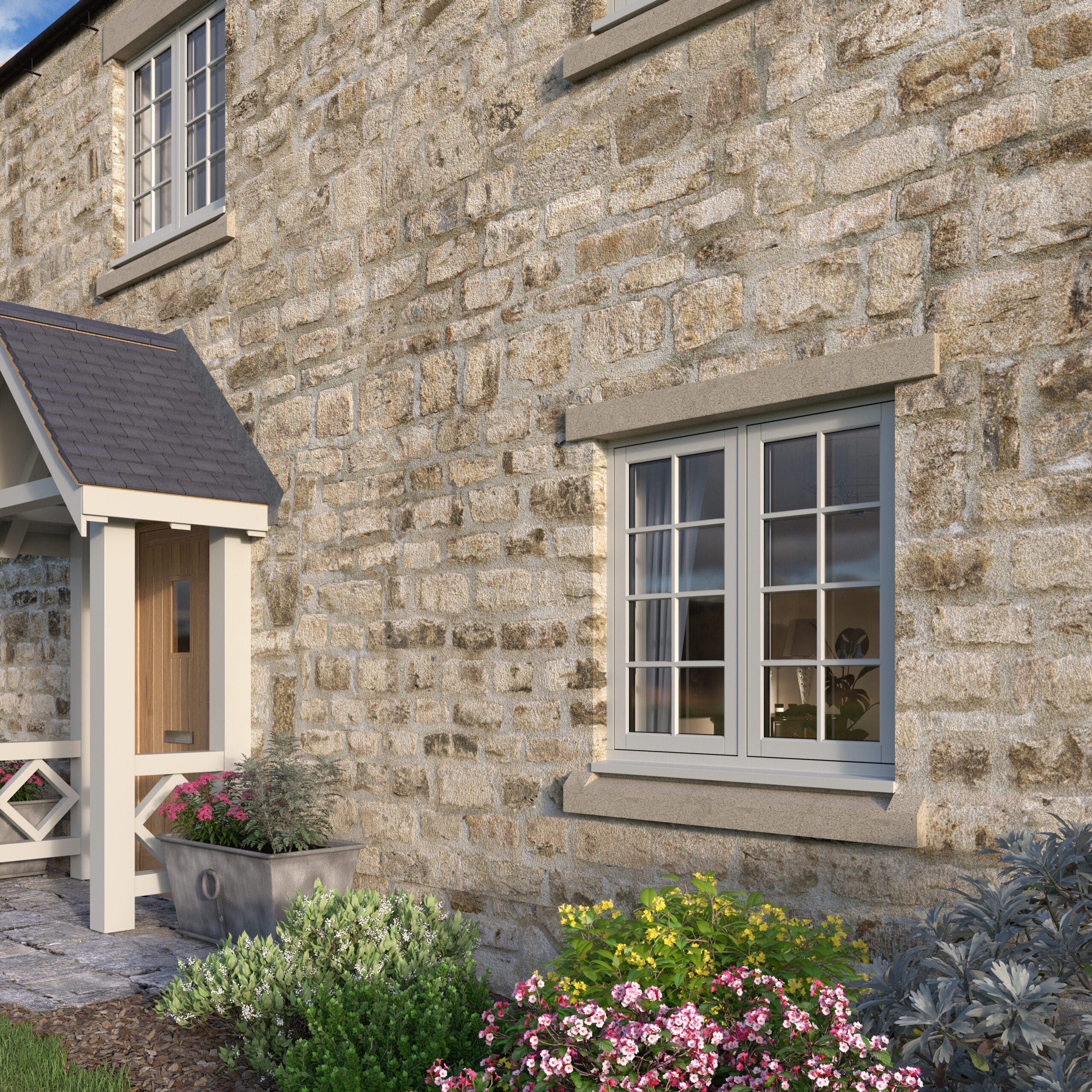
Pastels may feel very contemporary but they’ve been a feature of interior design since the 18th century. They’re definitely experiencing a surge in popularity, with millions of pastel-themed posts across social media. And you can absolutely tap into this trend when it comes to your window frames. Pastels can highlight your windows without distracting from your property’s overall style. Many of these colours really suit traditional or rural properties, especially those made of stone or Cheshire brick.
Going green
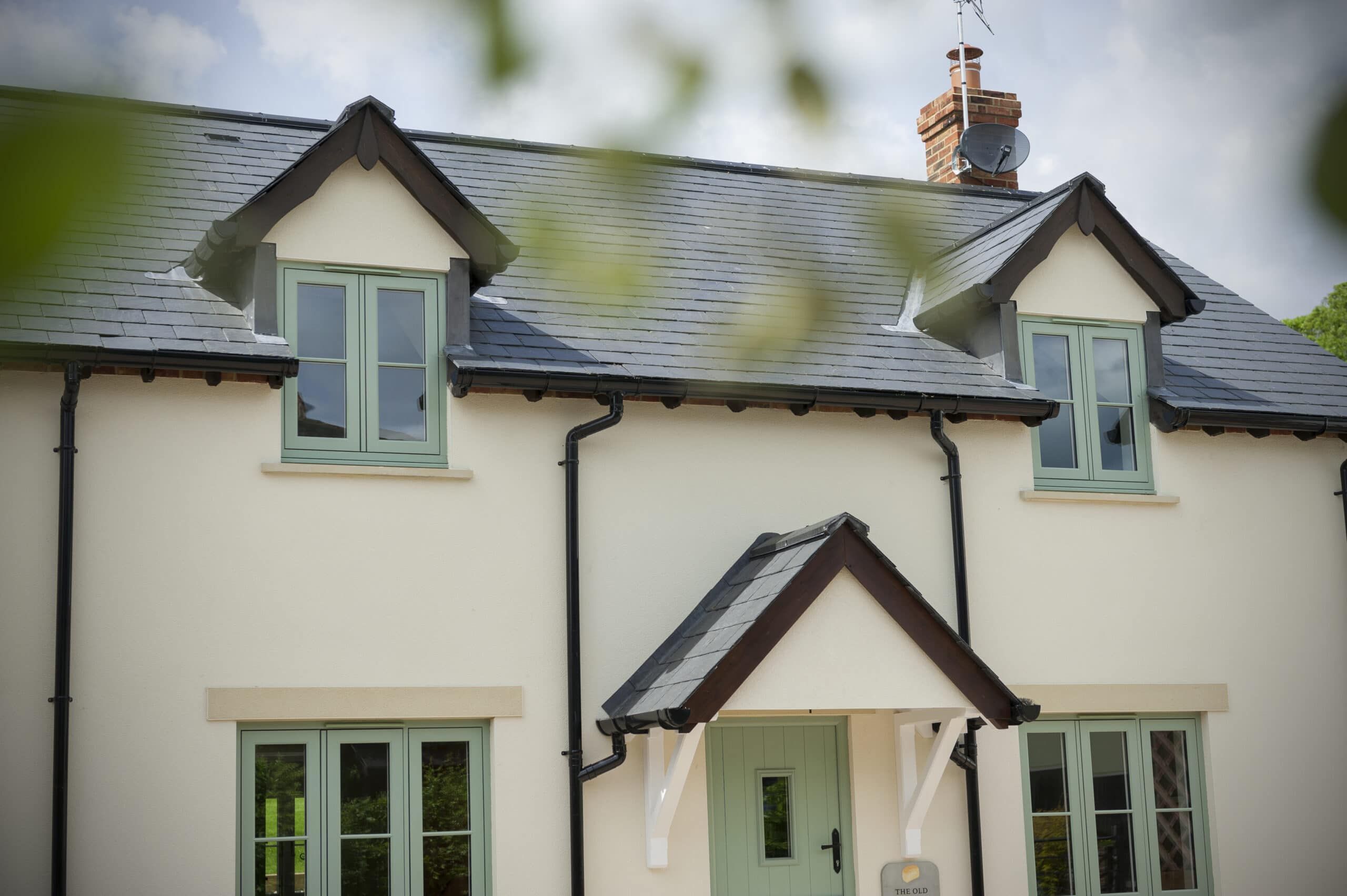
Pastel greens are a particularly fashionable shade. They manage to be both eye-catching and understated, and they bring the tranquillity associated with the natural world into your home. Green window frames also complement another contemporary trend – houseplants.
Houseplants are a really easy way to transform a room and could even lead to a new hobby! The sheer variety means you can find plants to suit any room and any lifestyle. Go for ferns or spider plants in high humidity rooms like the bathroom, wrap climbing plants around mirrors or picture frames, or choose succulents if you think you might forget to water your plants regularly (we’ve all been there). Terracotta also complements green perfectly so consider lining up some rustic plant pots along your windowsill.
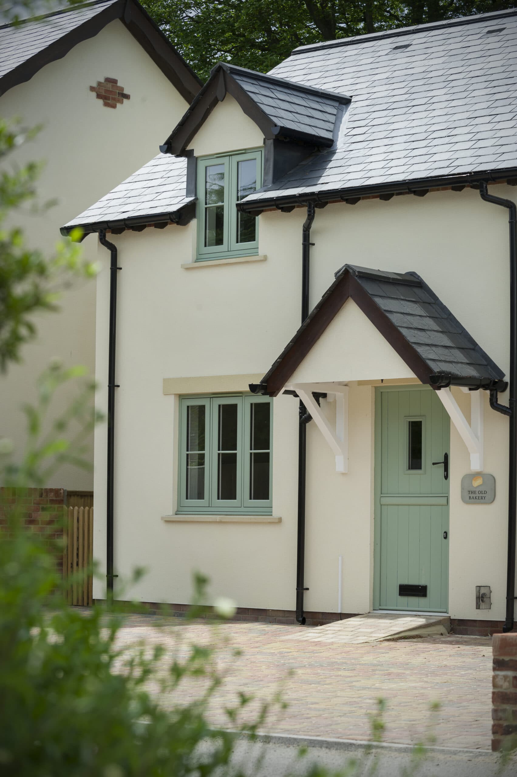
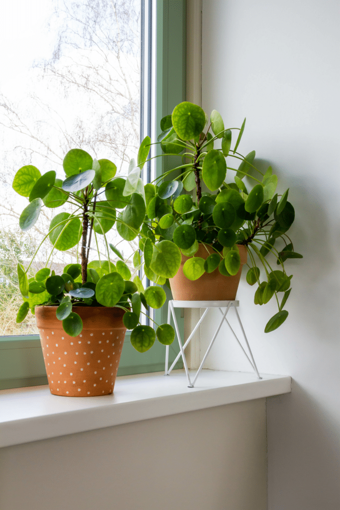
Right: Green frames are a great match for your indoor jungle!
Take a trip to Painswick
Painswick – a silvery green – is another popular pastel choice. This is a neutral hue with a twist. Named after the town in the Cotswolds and inspired by the colour of its buildings, it works perfectly against light-coloured stone. Painswick provides an elegant backdrop to classic, country house interior styles. Think richly woven rugs, floor-to-ceiling books or jewel-coloured wallpaper. However, Painswick’s cool tones can also create a coastal aesthetic that is open, airy and relaxed. Add decorative touches like jute, rattan or weathered wood and it doesn’t matter if you live miles from the beach – you can bring that beachy feel to you.
Down to earth
Rustic, earthy shades can help your home feel even more inviting. Cream brings a softer look than white and is well suited to older or cottage-style properties, particularly those with stone windowsills. Where white frames look bright and clean, cream has a more muted, sophisticated aesthetic. Layering neutral shades like cream, beige and natural wood can create a serene, zen-like atmosphere. This works particularly well in period properties with high ceilings and large windows. Imagine closing the front door behind you after a hard day at work, kicking off your shoes and soaking up the relaxing atmosphere.
Warmer earth tones, like terracotta or clay, are equally calming. Like green, they bring a sense of the natural world into your home, especially if you accessorise with other organic elements like woven baskets, ceramic plant pots or earthenware bowls. The colours in this palette all work really well together, for example, a pop of burnt ochre looks great as an accent colour against cream (or vice versa).
Right: The Residence Collection R9 flush window in Clay, an earthy neutral, complemented by timber and earthenware
Back in black or going grey?
If you’re looking to make a statement with your windows, dark shades are a great choice and they’re also incredibly on trend right now.
One of the most popular frame colours in the UK is Anthracite Grey – a charcoal-esque dark grey. Black is another very fashionable choice for frames. Both are striking and surprisingly versatile shades that work well with modern properties. They also look amazing on slimline aluminium frames.
Dark frames are a good companion to industrial interior design. Think open plan with clean lines, exposed brickwork, concrete floors or steel beams. The industrial look is very minimalist, with lots of storage to cut down on clutter and carefully curated accessories that are practical as well as decorative. Even if you’re not living in a loft or converted factory, features like metal lighting, bare Edison bulbs, repurposed furniture, or distressed leather can recreate that industrial feel.
framing this industrial-style interior
The pared-back, open look of industrial design makes a space feel relaxed and maximises the amount of light (especially if you use aluminium window frames with their narrow sightlines). And its functional aesthetic means a place for everything and everything in its place – which can also help keep stress levels down!
Lighter shades of grey are cool, sophisticated and suit both modern and period homes. It’s a good option if your windows are smaller as it can help them stand out without overpowering them. If your space has lots of natural light, consider layering similar shades through soft furnishings, artwork and accessories for a truly elegant look. Alternatively, try matching any internal woodwork to the colour of your frames for extra definition.
Pale grey can risk looking a little chilly so if you’d like it to feel more homely, combine with yellow or pale pink. These colours perfectly complement pale grey and look stylish at the same time (in fact, grey and pink has been one of the go-to colour combinations for some time). Pick soft furnishings in natural fabrics or bold wall art where pink/yellow is the dominant colour for a beautiful contrasting design.
mixed textures and warm, wooden floorin
Mix and match
You can also mix colours in the right circumstances. A period property with a modern extension can have sash windows in heritage colours at the front and dark slimline aluminium frames on the extension. It’s also possible to have different colours on the same frame – one for the outside and one for the inside. These are known as dual colour windows and are a great way of compromising on your colour scheme. Perhaps you’ve found the perfect shade for your room’s aesthetic but it’s not suitable for your home’s exterior. Maybe you live in a heritage building which limits the colours you can use externally. Or maybe you simply can’t decide between two colours. The Residence Collection offer this option but bear in mind that it’s not available with all of their colours. Contact us to find out more.
Find your true colours
Colour is lots of fun and the possibilities are endless. New window frames can bring out the best of your building, work in harmony with your interior design and even influence your mood. Your windows are more than just purely functional – so don’t forget to make the most of them.
We offer frames in a wide range of colours to suit all properties. Get in touch with our friendly team to chat through your options and find your true colours.